Introducing our new logo
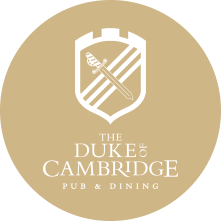
As part of our refurbishment this spring, we are re-branding the pub and are delighted to share our new logo with you:
The design was created by local, Farnham based company, Chunk, who we have been working with for a couple of months to come up with a logo which represented the pub and its heritage.
The current Duke of Cambridge’s coat of arms, when issued, was given 3 labels on the lion, in contrast to the conventional 5. This is to signify he is heir to the throne and so is reflected here in the use of threes – three lines, three ‘bridges’ on the shield.
The sword refers to the military connection of the ‘Duke’ title, the highest military title, developing a modern version of the original Duke’s sword.
The shield is to signify the royal connection and the bridges of Tilford and Cambridge are represented in the design of the top of the shield.
We hope you like it!


